Avoid These Common Web Design Mistakes for Exceptional User Experience

27 Jun 2023 Last updated: 25 Apr 2024 By Agile Agency

At Agile, we understand the importance of providing a positive user experience through well-designed websites. A website that is intuitive, visually appealing, and user-friendly not only enhances the overall experience but also contributes to the achievement of your business goals.

Avoid These Common Web Design Mistakes for Exceptional User Experience

However, several common web design mistakes can have a significant impact on user experience, resulting in frustration, decreased engagement, and a higher bounce rate.

In this article, we will explore these mistakes in detail and provide actionable insights on how to avoid them, ensuring exceptional user experience for your website visitors.

So, let’s dive into the world of web design and discover the key mistakes to avoid when creating a website that captivates and delights your audience.

1. Neglecting Mobile Responsiveness

In today’s mobile-driven world, neglecting mobile responsiveness in web design can be a detrimental mistake. With the increasing number of users accessing websites through mobile devices, it’s essential to provide a seamless and optimised experience across different screen sizes.

What is a mobile-friendly design?

Mobile-friendly design refers to creating a website that adapts and adjusts its layout and content to provide an optimal viewing experience on mobile devices. This design approach allows users to easily navigate, read, and interact with your website, regardless of the device they are using. A mobile-friendly website ensures that your content is accessible and visually appealing, leading to increased engagement and user satisfaction.

responsive web design

The impact of mobile usage on website traffic

Mobile usage has witnessed a remarkable surge in recent years, with more people relying on smartphones and tablets to browse the internet. Ignoring mobile responsiveness can result in a significant loss of website traffic and potential customers. Visitors who have a poor experience on a non-responsive website are more likely to leave quickly, resulting in higher bounce rates and lower conversion rates. On the other hand, a mobile-friendly website attracts and retains mobile users, leading to increased engagement and conversions.

Key issues to address

Non-Responsive Layouts

Ensure your website’s design adapts fluidly to different screen sizes and resolutions. Use responsive frameworks or CSS media queries to adjust the layout and optimise content visibility.

Unoptimised Text and Images

Pay attention to text legibility and image scaling on mobile devices. Make sure fonts are large enough to read without zooming, and images are appropriately sized for different screen resolutions.

Test your website on various devices and screen sizes to ensure it is responsive across the board. Incorporate responsive design principles from the early stages of development to avoid significant redesign efforts later on.

Remember:

A mobile-friendly website is not only important for user experience but also plays a significant role in search engine rankings, as search engines prioritise mobile-friendly websites in their mobile search results.

2. Complex Navigation Structure

Navigation serves as a roadmap for users, guiding them through your website and helping them discover relevant content. When your navigation is clear and intuitive, visitors can easily find what they’re looking for, leading to increased engagement, longer session durations, and improved conversion rates. A well-designed navigation structure enhances user satisfaction and encourages them to explore more of your website.

Userlane website is a great example of a clear navigation structure
Userlane.com is a great example of how powerful keeping things to the point can be

Common navigation mistakes to avoid

Hidden Menus

Concealing the main navigation menu can confuse users and make it difficult for them to access important sections of your website. It’s essential to keep the menu visible and easily accessible, preferably at the top of the page.

Overcomplicating the Menu

It’s important to keep the navigation menu simple and intuitive. Avoid overcrowding it with too many options, as it can overwhelm visitors. Organise menu items logically and use clear labels that accurately represent the content they lead to. By simplifying your menu structure, you provide users with a clear path to their desired information.

Unclear Call-to-Action Buttons

Another common web design mistake is having unclear call-to-action (CTA) buttons. Your CTA buttons should stand out and indicate the desired action. Use concise and action-oriented wording that leaves no ambiguity about the next step for users. By making your CTA buttons prominent and compelling, you encourage users to take the desired actions and engage further with your website.

Tips for designing user-friendly navigation menus

To create a user-friendly navigation menu that enhances the overall user experience, consider the following tips:

  1. Simplicity is key: Keep your navigation menu simple and uncluttered. Limit the number of options to the most important sections and use concise labels that accurately describe each page.
  2. Logical organisation: Organise your menu items in a logical and hierarchical structure. Group related pages together and arrange them in a way that makes sense to users. Consider conducting user testing to ensure that the organisation of your menu resonates well with your target audience.
  3. Clear visual cues: Use visual cues, such as hover effects or highlighting, to indicate active or selected menu items. This helps users understand their current location within your website and provides visual feedback.
  4. Responsive design: Ensure that your navigation menu is responsive and adapts to different screen sizes. On smaller screens, consider using a collapsible or hamburger menu icon to save space while maintaining accessibility.
Continuously refining and improving navigation based on user insights will contribute to an exceptional user experience. Click To Tweet

3. Slow Page Loading Speed

Nowadays, where attention spans are short and competition is fierce, users expect websites to load quickly. Slow websites can have a detrimental impact on user engagement, lead to high bounce rates and even affect your search engine optimisation (SEO) efforts.

NNGroup: Top 10 Web Design Mistakes

The negative impact of slow loading speeds on user engagement and SEO

  1. User frustration and abandonment: When users encounter slow-loading web pages, they often become frustrated and impatient. Research shows that even a one-second delay in page load time can result in a significant increase in bounce rates. Users expect instant gratification, and if your website fails to deliver a fast and seamless experience, they are likely to abandon it and seek alternatives.
  2. Decreased user satisfaction: Slow loading speeds hinder the overall user experience, leading to decreased satisfaction. Users may perceive your website as unreliable or unprofessional, which can damage your brand reputation and deter them from returning in the future.
  3. SEO ranking implications: Search engines, such as Google and Bing, consider page loading speed as one of the ranking factors. Slow-loading websites may receive lower rankings in search results, making it more challenging for users to discover your content. Improving your loading speed can positively impact your SEO efforts and increase your visibility in search engine rankings.

Factors that contribute to slow loading times

Some factors contributing to slow loading speed are:

Large Image Sizes

Optimise your images by compressing them without compromising quality. Use appropriate file formats and consider lazy loading techniques to ensure images are loaded only when they become visible to the user.

Poor Server Performance

The quality and speed of your hosting provider’s servers can impact your website’s loading speed. Choosing a reliable and high-performance hosting provider is crucial for ensuring fast and responsive web pages.

Excessive HTTP Requests

Each element on your web page requires an HTTP request to the server, including images, scripts, and stylesheets. The more requests your page needs to make, the longer it will take to load. Combining and minimising these requests can significantly improve loading speed.

Too Many Plugins and Scripts

Examine the plugins and scripts you’ve installed on your website. Remove any unnecessary ones and optimise the code to reduce the impact on loading speed.

Regularly monitor your website’s loading speed using tools like Google PageSpeed Insights or GTmetrix. Identify areas for improvement and work with your development team to implement performance optimisations.

Techniques to optimise website performance and improve loading speed

To enhance your website’s performance and minimise loading times, consider implementing the techniques described in our article “Learn how to improve your Core Web Vitals For better SEO” shown below:

4. Cluttered and Overcomplicated Layouts

When it comes to web design, simplicity is key. A cluttered and overcomplicated layout can overwhelm your visitors, hinder their user experience, and make it difficult for them to navigate and find the information they need.

Why is important to have a clean and organised design?

  1. Enhanced user experience: A clean and organised layout ensures that visitors can easily understand and navigate your website. It allows for intuitive user interactions and a seamless browsing experience, leading to higher engagement and satisfaction.
  2. Improved readability: Cluttered layouts with excessive text and overcrowded elements make it challenging for users to read and comprehend your content. By adopting a clean design, you can enhance the readability of your text, making it more accessible and engaging for your audience.
  3. Faster loading times: Unnecessary design elements and excessive visual clutter can increase the loading times of your web pages. A streamlined layout with minimal distractions helps optimise your website’s performance, resulting in faster loading speeds and improved user experience.

Common mistakes that result in cluttered layouts

Small or Low-Contrast Fonts

One mistake to avoid is using small or low-contrast fonts. Choose fonts that are easily readable and have appropriate sizes for different devices. Ensure there is sufficient contrast between the text and the background to enhance readability. By making your content visually accessible, you create a more enjoyable reading experience for users.

Excessive Text

Lengthy paragraphs and dense blocks of text can overwhelm users and make it difficult to absorb information.

Avoid lengthy paragraphs and break your content into smaller, digestible chunks with clear headings, subheadings, and bullet points.

Overcrowded elements

Cramming too many elements, such as images, buttons, and icons, into a limited space can create a cluttered and chaotic appearance. Give each element enough room to breathe, and maintain a balanced visual hierarchy.

Engaging Users Effectively

Lack of Whitespace

Whitespace, also known as negative space, refers to the empty spaces between elements. A lack of whitespace can make your design feel cramped and confusing. Utilise whitespace strategically to create separation and improve visual clarity.

Tips for creating visually appealing and user-friendly layouts

  1. Embrace minimalism: Adopt a minimalist approach by focusing on essential elements and removing unnecessary clutter. Use ample whitespace, simple typography, and limited colour palettes to create a clean and visually pleasing design.
  2. Prioritise content hierarchy: Hierarchically organise your content, emphasising the most important information. Use headings, subheadings, and typography variations to guide users through your content and make it scannable.
  3. Utilise visual cues: Use visual cues, such as arrows, icons, and buttons, to direct users’ attention and guide them through your website. These cues can help users understand the purpose of different elements and navigate your site effortlessly.
  4. Optimise image usage: Choose high-quality images that are relevant to your content and purposefully placed. Avoid using too many images that can distract users or slow down your website’s loading speed.
  5. Ensure responsive design: Make sure your layout is responsive and adapts well to different screen sizes and devices. Test your design on various devices and resolutions to ensure a consistent and user-friendly experience.
Simplicity and clarity are the foundations of a successful web design. Click To Tweet

5. Lack of Clear Call-to-Action

A well-designed website not only provides valuable information but also guides visitors towards taking specific actions. This is where a clear and effective call-to-action (CTA) comes into play.

The significance of effective CTAs in guiding user actions

  1. Driving conversions: CTAs serve as prompts that encourage users to take the desired actions on your website, such as making a purchase, subscribing to a newsletter, or filling out a form. Well-designed and strategically placed CTAs can significantly increase conversion rates and drive business growth.
  2. Improved user experience: CTAs provide clear directions to users, making it easier for them to navigate your website and accomplish their goals. By offering intuitive and well-crafted CTAs, you enhance the overall user experience and reduce any confusion or frustration that visitors may experience.
  3. Encouraging engagement: CTAs can be used to encourage user engagement and interaction, such as sharing content on social media, leaving comments, or participating in surveys. Engaged users are more likely to spend more time on your website, explore your offerings, and become loyal customers.

Mistakes to avoid when implementing CTAs

  1. Vague wording: Using generic or ambiguous phrases for your CTAs can confuse users and fail to convey the intended action. Ensure your CTAs have clear and concise wording that clearly states the desired action and its benefits.
  2. Poor placement: Placing your CTAs in inconspicuous locations or burying them within the content can diminish their visibility and effectiveness. Optimise your CTA placement by positioning them prominently, such as above the fold or at the end of relevant content sections.
  3. Overwhelming options: Offering too many CTAs on a single page can overwhelm users and lead to decision paralysis. Limit the number of CTAs and prioritise the most important actions to guide users towards the desired conversions.

Strategies for creating compelling and conversion-focused CTAs

  1. Use action-oriented language: Craft your CTAs using action verbs that create a sense of urgency and motivate users to take immediate action. Examples include “Get started now,” “Sign up for free,” or “Shop now.”
  2. Highlight benefits: Communicate the value or benefits users will receive by clicking on the CTA. Focus on the unique selling points or incentives that encourage users to engage.
  3. Create visual contrast: Make your CTAs visually stand out by using contrasting colours, bold typography, or button styling. This helps draw attention to the CTA and increases its click-through rate.
  4. Ensure mobile-friendliness: With the increasing use of mobile devices, it’s crucial to design CTAs that are easily clickable and visible on small screens. Test your CTAs on different devices and screen sizes to ensure a seamless experience.
  5. A/B test and optimise: Continuously test and optimise your CTAs to improve their performance. Experiment with different designs, placements, colours, and wording to identify what resonates best with your target audience.

By implementing these strategies, you can create compelling CTAs that effectively guide user actions, improve conversions, and enhance the overall user experience on your website.

A clear and persuasive call-to-action can make a significant difference in driving user engagement and achieving your business objectives. Click To Tweet

6. Inconsistent Branding
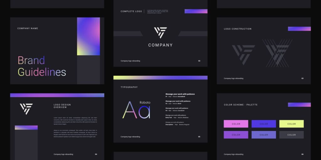
Consistent branding is vital for building trust and recognition. Inconsistent branding can confuse users and undermine the professional appearance of your website.

In this section, we will explore the importance of consistent branding, common mistakes to avoid regarding branding and strategies for maintaining a cohesive and impactful brand identity.

The Importance of Consistent Branding

  1. Building trust and recognition: Consistent branding helps create a sense of familiarity and trust among your website visitors. When users encounter consistent visual elements, such as colours, fonts, and imagery, they develop a stronger connection with your brand and find it easier to recognise and remember your website.
  2. Establishing a strong brand identity: A consistent tone and voice in your website’s copy contributes to the establishment of a distinct brand personality. By maintaining consistency in the way you communicate with your audience, you can reinforce your brand values, connect with your target audience, and differentiate yourself from competitors.
  3. Enhancing professionalism: Inconsistent branding can undermine the professional appearance of your website. By maintaining a cohesive visual identity and adhering to your brand guidelines, you convey a sense of professionalism and attention to detail, which positively impacts user perception and trust.

Mistakes to Avoid with Branding

Incoherent Visual Elements

Inconsistent use of colours, fonts, and imagery can confuse users and dilute your brand identity.

Use consistent colours, fonts, and imagery throughout your website to create a cohesive visual identity. Ensure that your branding aligns with your overall marketing strategy.

Mixed Tone and Voice

Inconsistency in the tone and voice of your website’s copy can create confusion and disrupt the brand experience.

Maintain a consistent tone and voice in your website’s copy. This helps in establishing a strong brand personality and connecting with your target audience.

Strategies for Maintaining Consistent Branding

  1. Develop brand guidelines: Create comprehensive brand guidelines that outline your visual and verbal branding elements. These guidelines should include specifications for colours, fonts, imagery, tone, and voice. Share these guidelines with your team and ensure they are consistently implemented across your website.
  2. Regularly review and update: Continuously review your website to identify any deviations from your brand guidelines. Regularly update your website’s content and design elements to ensure they align with your branding. This includes checking for inconsistencies in visual elements, messaging, and overall user experience.
  3. Train your team: Educate your team members, including designers, developers, and content creators, about your brand guidelines. Provide training sessions to ensure everyone understands the importance of consistent branding and how to implement it correctly.
  4. Enforce consistency: Establish a review process to ensure that all new content and design updates adhere to your brand guidelines. Assign a designated team member or brand manager to oversee consistency and make necessary adjustments as needed.
brand guidelines

Consistent branding will contribute to building trust, recognition, and professionalism, enhancing the overall user experience and supporting your business objectives.

Conclusion: Delivering a Great User Experience

Avoiding these common web design mistakes is essential for delivering a positive user experience. By addressing issues related to poor navigation, slow loading speed, lack of responsiveness, poor readability, and inconsistent branding, you can create a website that engages users, encourages exploration, and supports your business objectives.

Regularly reviewing and optimising your website’s design, functionality, and content is essential to ensure it remains user-friendly and impactful. By implementing the strategies discussed in this article, you can create a website that not only attracts visitors but also keeps them engaged and encourages conversion.

Remember, an exceptional user experience leads to increased customer satisfaction, improved conversion rates, and long-term success for your online presence.

How Agile can help

Agile, with its expertise in web design and digital marketing, stands ready to guide and support your professional services business in designing great user experiences for your customers.

Top Web Design Company London 2024 - - By Clutch

Our commitment to excellence is underscored by our recognition as a Top Web Design Company in London for 2024.

Agile Agency Agile Agency

Agile is an independent Digital Marketing Agency headquartered in London, specialising in web design and digital marketing. Our proficiency is underscored by several HubSpot Certifications, and we take pride in being recognised as a 2023 Global Award Winner for SEO by Clutch. At the heart of our success lies a team that seamlessly navigates the intersection of technology and marketing, ensuring innovative and impactful solutions for our clients.