Html Email Templates: 9 Steps To Success
Email marketing is still one of the most effective digital channels to see a great ROI. Many professional services businesses rely on it to build brand awareness, communicate with prospects and customers, and promote their services and products.
However, it is still largely ignored by companies, especially when they want to create original email marketing campaigns (as opposed to using basic HTML email templates).
HTML emails aren’t web pages – don’t treat them as such
If you thought that there are far too many web browsers out there, things get even worse in the email world.
When you consider the variety of email client programs that are available right now, a simple task can quickly turn into a daunting one. Outlook, for example, has several versions available for desktop, webmail, and mobile environments. As you will discover, all these “Outlooks” may render an HTML email differently.
This is why designing and building HTML emails is a whole new ball game. To create a successful HTML Email Template, there are 9 points to consider:
Table of contents:
1. Learn specific HTML email coding techniques
2. Design with ‘mobile first’ in mind
3. Use live text on your key messages instead of having them as images
4. Learn the tricks to succeed with Outlook
5. Use safe web fonts as a fallback font if you use ‘custom’ fonts
6. Include fallback colours for your background images
7. Optimize your images
8. Using animated GIFs
9. Test your HTML Email thoroughly
1. HTML email coding knowledge is required
You wouldn’t hire a print designer to design a website. You want someone who is experienced in digital design and UX. HTML email design requires a deep understanding of email client apps and rendering issues in order to maximize your marketing campaign reach.
Our recommendation:
Designers and programmers need to collaborate early on to determine the best approach for your email design. Your programmer needs to know what works and what doesn’t in HTML emails. Otherwise, you may receive an HTML template that looks great through the web browser but renders poorly in emails.
2. Design with mobile-first in mind
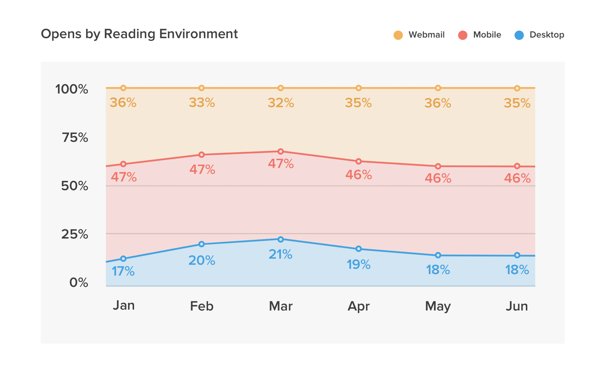
Mobile devices remain the most popular reading environment for HTML emails.
(source: litmus)
Taking this into account, it’s no wonder that 51% of people unsubscribe from newsletters because they don’t look good on smartphones.
Fortunately, most email clients now support responsive content, so you can include specific code for different screens in your emails and optimize the experience for mobile users.
Whenever possible, use live text for your copy if your design is well-planned. A good example of using both techniques is shown below: a device-specific image and live text (more on that later).
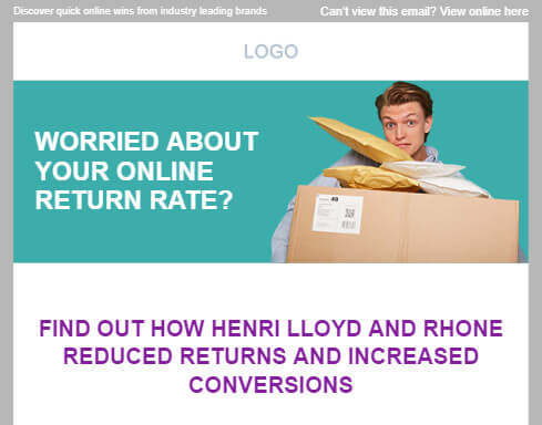

On the first image is a desktop version, on the second image – the same email on mobile devices where we use a mobile-specific image moved under the title and we increased the font size for better readability.
Our recommendation:
Design mobile-specific images twice as wide so they don’t look blurry on retina displays.
3. Keep as much ‘live text’ as possible
In the previous section, you saw an HTML email design that combines copy and image on a petrol-colored solid background.
The solid color allows us to code that section as two blocks: one with a background color and live text above it, followed by an image block (which makes the responsive HTML email look consistent across all devices).
Our recommendation:
You should use live text on your HTML email template in order to:
1. Edit that text whenever necessary.
2. If your email client blocks your images, recipients will still be able to read the text.
4. Beware of Outlook
Unlike most other email clients, Outlook has limited support for modern CSS. Yet, in its various versions, there are a few technical workarounds that you can implement.
The designer usually creates amazing email designs, but once they’re coded and sent to you, the email looks completely different, especially in Outlook. For example, a call-to-action that’s designed with rounded corners will appear as a rectangle with square corners in Outlook.
Therefore, your agency developers need to be aware of the technical details of all the different email clients and especially Outlook.
5. Pay attention to ‘Custom’ Fonts
It’s common for designers without HTML email templating experience to try to stay on-brand by using the same typography for emails as for the website. Remember that custom fonts might not render well in your customers’ email programs.
Our recommendation:
In your HTML email template, use a web-safe font as a fallback (e.g. Arial). The majority of devices and operating systems use web-safe fonts by default.
The following images illustrate what an email might look like without a fallback font:


Corbel custom font is used in the first image. Times New Roman is used in the second as a system default font.
6. Use fallback color for background images
Let’s face it: Designers love to use backgrounds of all kinds. They’re powerful visual elements that make your messages stand out, and we absolutely agree that it makes everything more attractive and appealing.
One of the biggest drawbacks of HTML emails is the partial lack of support for background images.
Some email clients won’t display backgrounds. You may instead have a blank white area with your important message at the top. You will end up with a hard-to-read (or even invisible) section if your copy is white.
Our recommendation:
Consider including a fallback color that appears when the background image does not load.
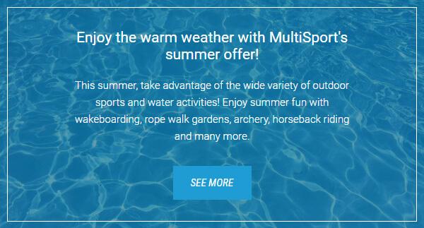

The first image shows live text on a background image. When the background image is blocked we see a solid background color (second image). In this particular case we used a fallback blue color to maintain brand colors and readability.
7. Reduce your assets size
Designers often include high-resolution photos in their email designs, but you must make sure that the images are resized and optimized before inserting them into your HTML email template. This will result in an email that is as lightweight as possible and renders quickly on a variety of devices.
Having a big latency decreases conversion rates of your email in the same way that page-load time affects bounce rates for websites.
Our recommendation:
Resize full-width images to a maximum of 1200px width, then run them through an image optimizer like TinyPNG. This will give you the right balance between image quality and file size.
8. Should you use animated GIFs?
In 2020, 51.28% of email marketers said that they used animated GIFs in marketing emails.
GIF animations are excellent for engaging readers and showcasing your products and services. In a nutshell, they simplify complex concepts.
Although it’s an attractive approach, there are some caveats:
1. Slow loading time
When using a mobile data connection, heavier files can take longer to load and play.
2. Decrease device performance
Your device may run slower and email apps may not respond as smoothly when you use GIFs.
3. Not supported by all email clients.
Outlook, for example, only renders the first frame of your GIF animation.
An example of why this is important is to imagine a GIF that ends with the most visually appealing frame. It is not visible to Outlook users unless you use the fallback option.
Consider inserting a separate fallback image with your preferred animation frame for Outlook. As an example, the first image below is an animated GIF as you would see it in most email clients. Users of Windows Outlook will see the second image without an Outlook-specific fallback image.
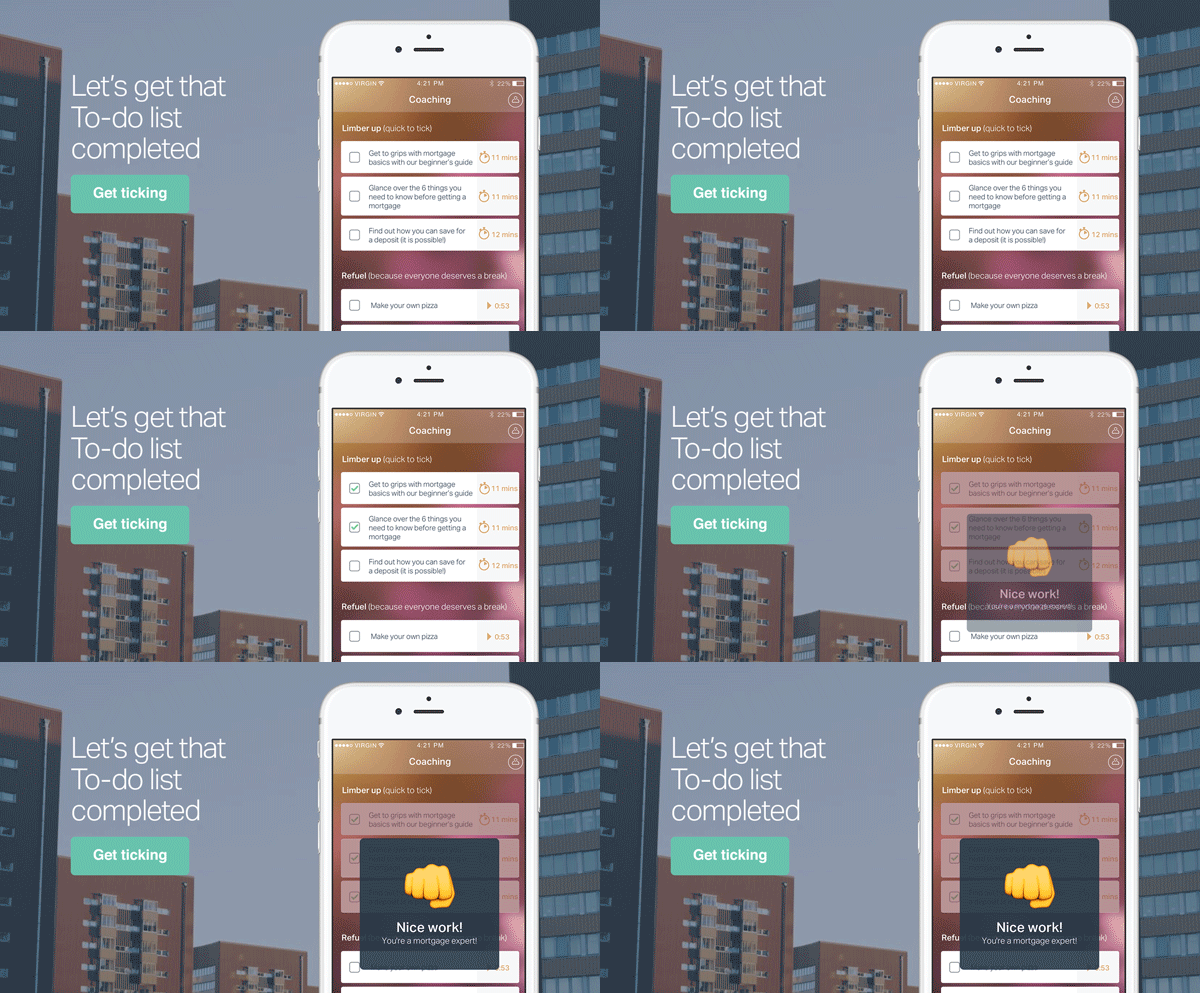
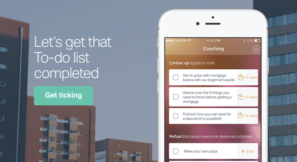
First image – animated GIF inserted in the email. The second image is what Windows Outlook users would see unless you add in your HTML code an Outlook-specific fallback image with your preferred animation frame.
9. Test your emails
Before sending an email campaign, test your email to ensure that it’s rendered properly across most – if not all – email client applications.
Our recommendation:
Litmus and EmailOnAcid provide previews of how your HTML email will appear across popular email clients for browsers, desktop and mobile apps.
Send and check your tests on the real devices and programs you normally use.
What else do you need to know?
These are some of the most important steps you should take to build solid, attractive HTML emails. To create a consistent, well-performing HTML email, you’ll need a few more tricks and tweaks – like handling long URLs (which can break your mobile layout), using gradient colors and many more.
How Agile agency can help
As a leading London Email Marketing Agency, we are pleased to offer assistance with any of the aforementioned steps—be it design, email coding, or the management of your email marketing campaigns—or all of the above.

Our commitment to excellence is underscored by our recognition as a Top Full Service Digital Agency in the United Kingdom for 2024.
I am a managing partner at Agile Digital. A graduate of Modern Balkan history, I made a complete pivot in my career when, together with Juan Pineda, we founded a nearshore design and development studio Sofyma in 2009, followed by our digital agency Agile several years later. Over time, I have worked on hundreds of digital projects from small startups to global brands. I enjoy writing in our Blog about topics I am actively involved in at work.
Related
Articles
